
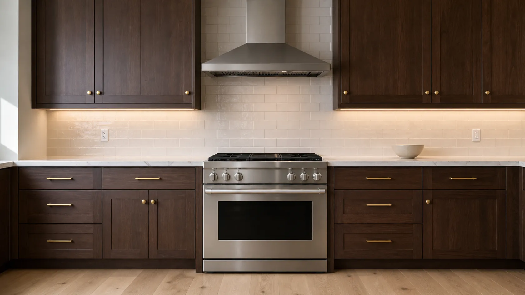

Dark cabinets with light countertops give you the strongest contrast in kitchen design. The cabinets anchor the room, the counters lift it, and the backsplash is the piece that decides whether the whole thing reads as intentional or as two finishes that happen to share a wall.
Most people get the cabinets and counters right and then stall on the backsplash. Stalling is the costly part, because indecision here holds up the whole job, and the backsplash is actually the cheapest of the three surfaces to change.
Start with the rule that answers the question most homeowners ask first: with dark cabinets, the backsplash should almost always be lighter. Dark cabinetry absorbs light. A pale backsplash gives it back.
It is also the cheapest lever you have. As one example from a home remodeling forum, a homeowner described a kitchen that felt dark to her because of the cabinet color, priced out replacing the cabinets at around $3,000, and instead of replacing them spent roughly $400 on a stone backsplash she installed herself. The room reads completely differently for an eighth of the cost. That trade sits behind most of the advice below.
The short answers
What should the backsplash match? Start from the countertop’s undertone, then check it works against the cabinet finish too. It should harmonize with the counter rather than copy it, and the cabinets set the contrast level.
What is the rule of thumb? Tile the wall between the countertop and the upper cabinets at minimum, run it full height behind the range, and keep the backsplash lighter in value than dark cabinetry.
Where should the money go? Splurge behind the range where it shows. Economize on the runs behind the sink and along the side walls.
Still deciding on the overall look? Our sister brand USA Cabinet Store has published a full 2026 kitchen backsplash trend report covering slab, zellige, warm neutrals and full-height coverage. This guide picks up where that one leaves off, for the dark-cabinet case specifically.
How common is this decision?
Houzz surveyed 1,780 US homeowners for its 2026 kitchen study and found that 85% of kitchen renovators upgraded their backsplash. Of those, 72% chose tile and 28% chose a slab.
Should a backsplash be lighter or darker than dark cabinets?
Lighter, in most kitchens. There is no rule in the building code sense, but the reasoning is straightforward.
Black, charcoal, espresso, dark walnut, dark cherry and the saturated darks like navy and deep forest green all absorb a large share of the light that hits them. In a kitchen with one window, that is the difference between a room that feels rich and a room that feels closed in. A light backsplash reflects light back across the counter and into the working area, and it keeps the contrast you paid for when you chose dark cabinets and light counters in the first place.
Those seven finishes behave differently from one another, and the cabinet-by-cabinet table further down gives each one its own answer. What they share is the light problem, so the starting rule holds across all of them.
There is a second reason that has nothing to do with light. A backsplash that matches the cabinets makes the wall disappear into the cabinet run, and the kitchen loses its layers. Keeping the backsplash closer to the countertop value gives you two clear bands instead of one dark mass.
Dark backsplashes do work with dark cabinets, but they need conditions: good natural light, strong under-cabinet lighting, pale counters and a room that is not small. More on that further down.
Choose the light countertop before the backsplash
This is the step most people skip, and it is why so many backsplash decisions stall.
The countertop is the expensive surface, the visually dominant one, and the hardest to change later. It should be selected first, and its undertones should drive the backsplash choice rather than the other way around. MSI makes the same recommendation in its guidance on pairing tile with quartz: pick the stone, look at it in the actual room, then hold tile samples against it.
Once the counter is chosen, decide which surface is the focal point. That single decision eliminates most of your options and saves you weeks.
A countertop with strong veining or movement needs a quiet backsplash. Something close to solid, with texture rather than pattern. If you put a dramatic marble-look quartz next to a busy geometric tile, the two fight and the eye has nowhere to rest.
A plain white or lightly speckled countertop is the opposite situation. It can carry a stronger tile, an unusual layout, or a real color, because there is nothing competing.
Then match undertones rather than matching colors. An exact color match usually looks forced. What you want is a repeated undertone:
- Warm white, cream or gold veining in the counter points to ivory, cream, warm greige or handmade tile
- Cool white, gray or blue veining points to crisp white, pale gray, blue-gray or cool green
- Brown, taupe or rust points to warm stone, greige, terracotta or earthy ceramic
Look at samples in the room itself, during the day and again at night with the under-cabinet lights on. Dark kitchens change character after sunset more than light ones do.
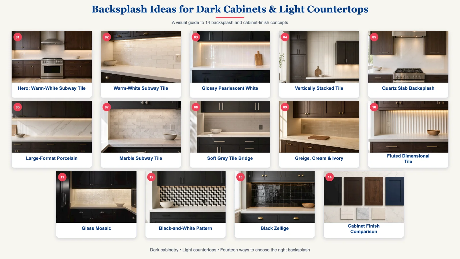
12 backsplash ideas for dark cabinets and light countertops
1. Warm-white subway tile
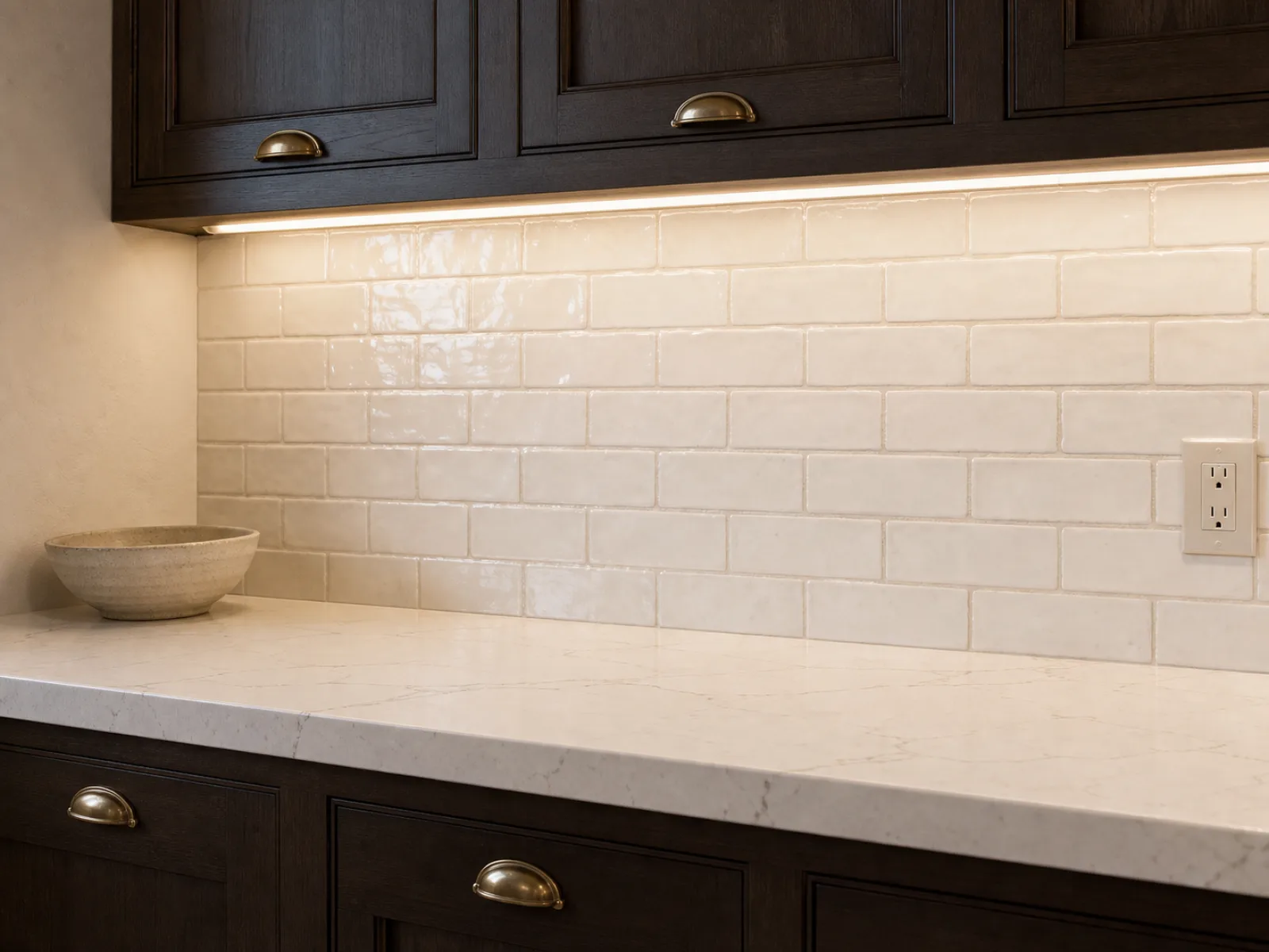
The safe default, and safe here is not a criticism. Warm-white subway works with black, charcoal, espresso and dark walnut, holds the contrast, reflects light, and never competes with a veined counter.
Houzz found white was the leading backsplash color in 2026 at 31%, with off-white close behind at 26%. That is most of the market choosing some version of this.
To keep it from looking generic, change one variable. Use handmade tile with irregular edges, or a crackled glaze, or an elongated proportion, or lay it vertically or in herringbone instead of the standard offset. Tonal grout finishes the job.
Use a creamier white with warm wood cabinets and warm counters. Use a cleaner white with cool charcoal and crisp white quartz.
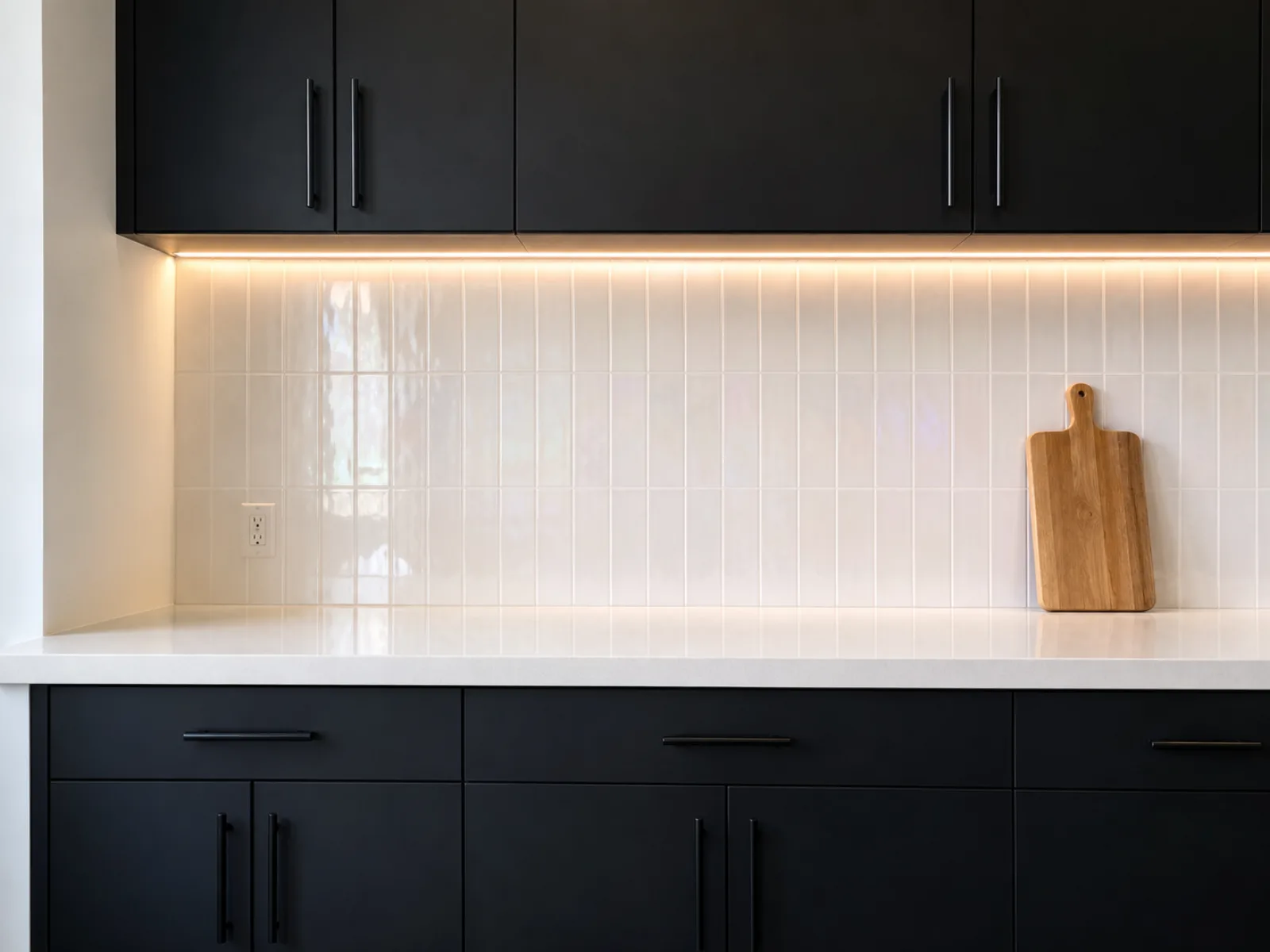
2. Glossy and pearlescent white for black cabinets
Gloss amplifies everything a pale backsplash is doing. Against true black cabinets, an iridescent or pearlescent white adds movement without becoming a pattern, which is useful when the counter is a plain white quartz and the room needs something to catch the eye.
This is a strong option for small kitchens and kitchens with one window, alongside glass mosaic, which does a similar job with more texture and more grout.
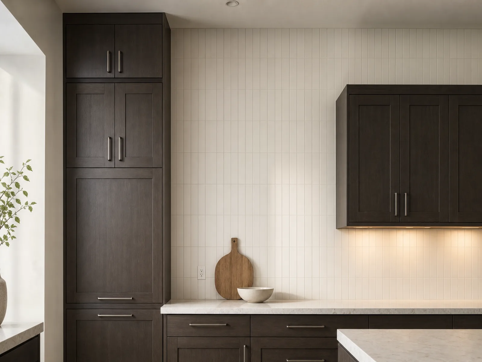
3. Vertically stacked tile
Stacking a rectangular tile vertically instead of horizontally pulls the eye up. In a kitchen with low ceilings or a narrow footprint, that is worth more than any color choice.
It also modernizes a tile shape people think of as traditional. Houzz reported in 2025 that 68% of renovators chose rectangular tile, with horizontal brick the most popular layout and vertical stack at 7%. The shape is common. The orientation is not.
Use tonal grout. Contrasting grout turns a vertical stack into a grid, which is a different and much louder effect.
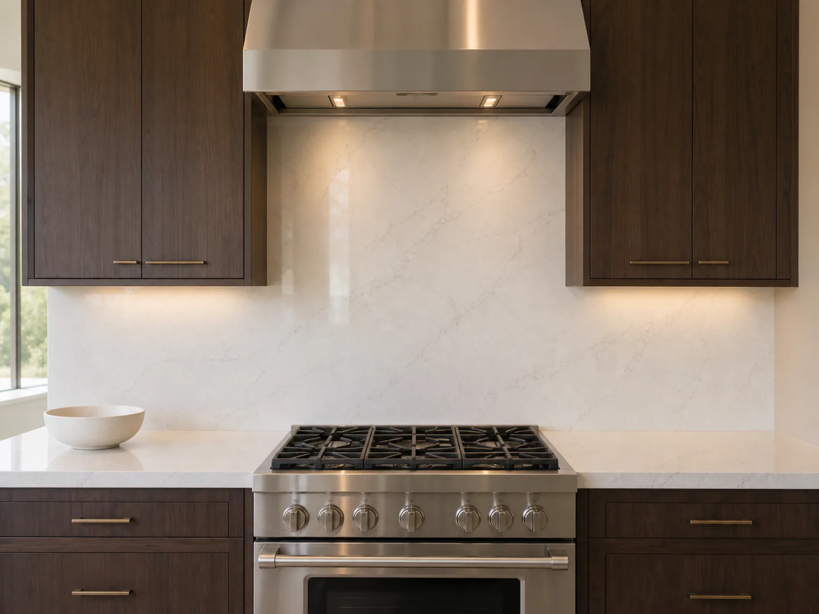
4. Slab backsplash: the light countertop carried up the wall
Running the countertop material up the wall removes the grout lines entirely and gives you one continuous surface. Behind a range it is the easiest thing in the kitchen to clean, and it makes the counter look thicker and more deliberate.
Houzz put slab backsplashes at 28% of 2026 renovations, so this is no longer unusual. Among people who chose slab, 39% used engineered quartz, an engineered stone product, and 33% used quartzite.
The catch is cost, and it catches people badly. In another example from a kitchen remodeling community, a homeowner had quartz countertops quoted at about $4,000, then found that adding an 18-inch slab backsplash pushed the total to roughly $9,000. The reaction in that thread was the same one we hear in the showroom: how is the backsplash more expensive than the countertop it is made from.
The answer is fabrication and waste. A backsplash needs its own slab cuts, its own edge work and its own template, and the yield off a slab is poor once you account for outlets and vein matching. A common compromise is slab behind the range only, with a quiet coordinating tile everywhere else. That gives you the grout-free run on the wall people actually look at.
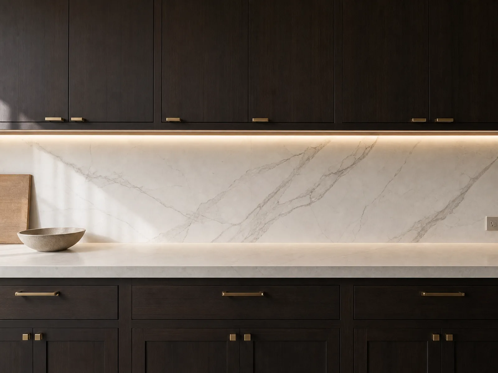
5. Large-format porcelain, the affordable slab substitute
Large-format porcelain gives you most of the slab effect at a fraction of the price. Fewer grout lines, marble-look patterning available, and far less maintenance than natural stone.
It is not a perfect substitute and you should know where it falls short. In a long uninterrupted run it reads beautifully. In a small galley kitchen, the panel seams sit closer together and become more noticeable than tile grout would have been. Check the wall length before you commit.
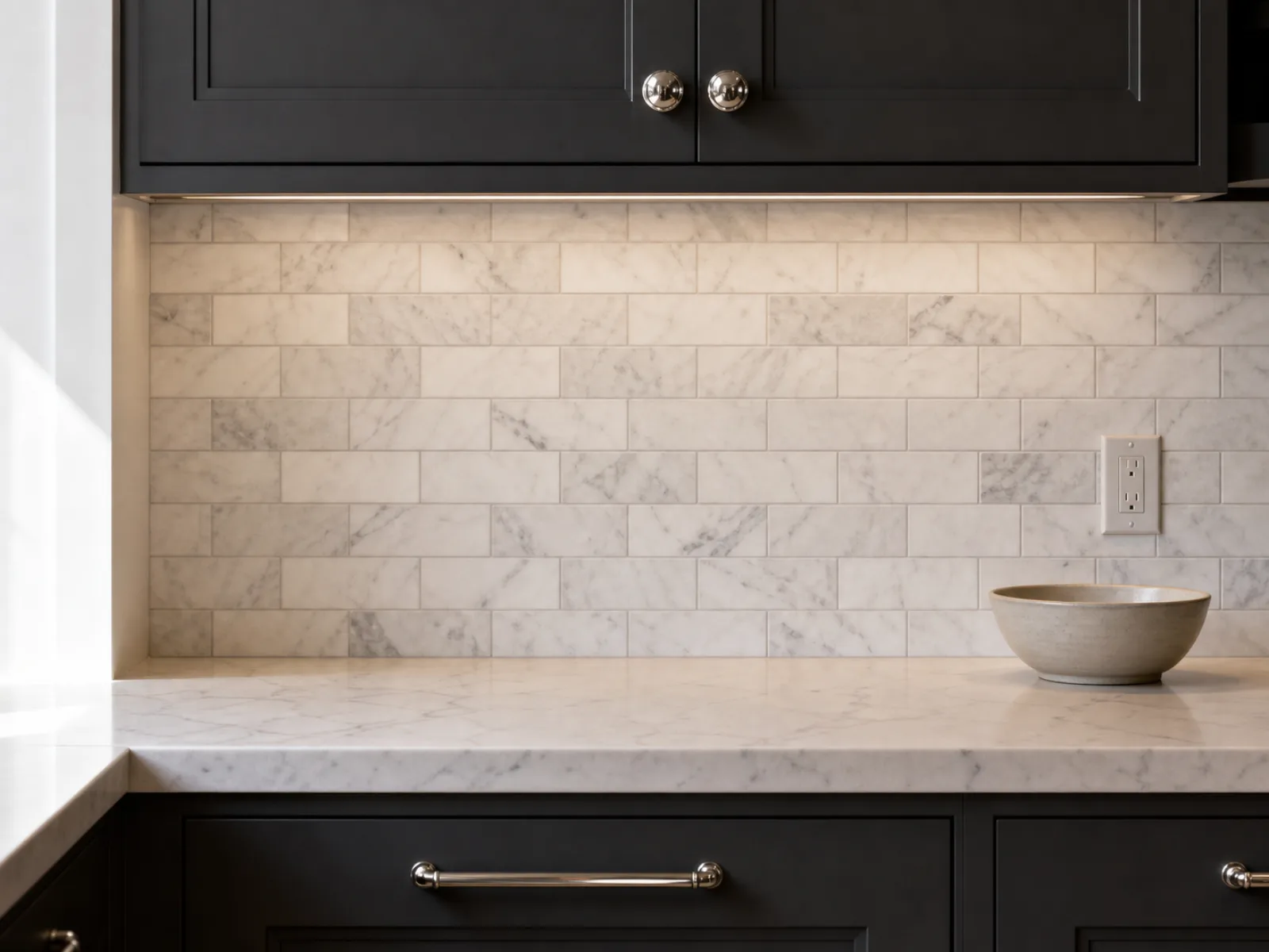
6. Thin marble subway tile
Marble subway gives you natural veining and a genuine stone surface without the visual weight of a full slab. It suits three pairings in particular: charcoal cabinets with white counters and gray Carrara-style marble, espresso cabinets with creamy counters and warm marble, and navy cabinets with white counters and a blue-gray marble.
Do not put a busy marble tile beside an equally dramatic countertop. Pick one to lead.
Marble is calcareous, which means acid-sensitive. The Natural Stone Institute advises identifying the stone type before choosing a cleaner, avoiding acidic products such as lemon and vinegar, and treating sealing as stain resistance rather than stain proofing.
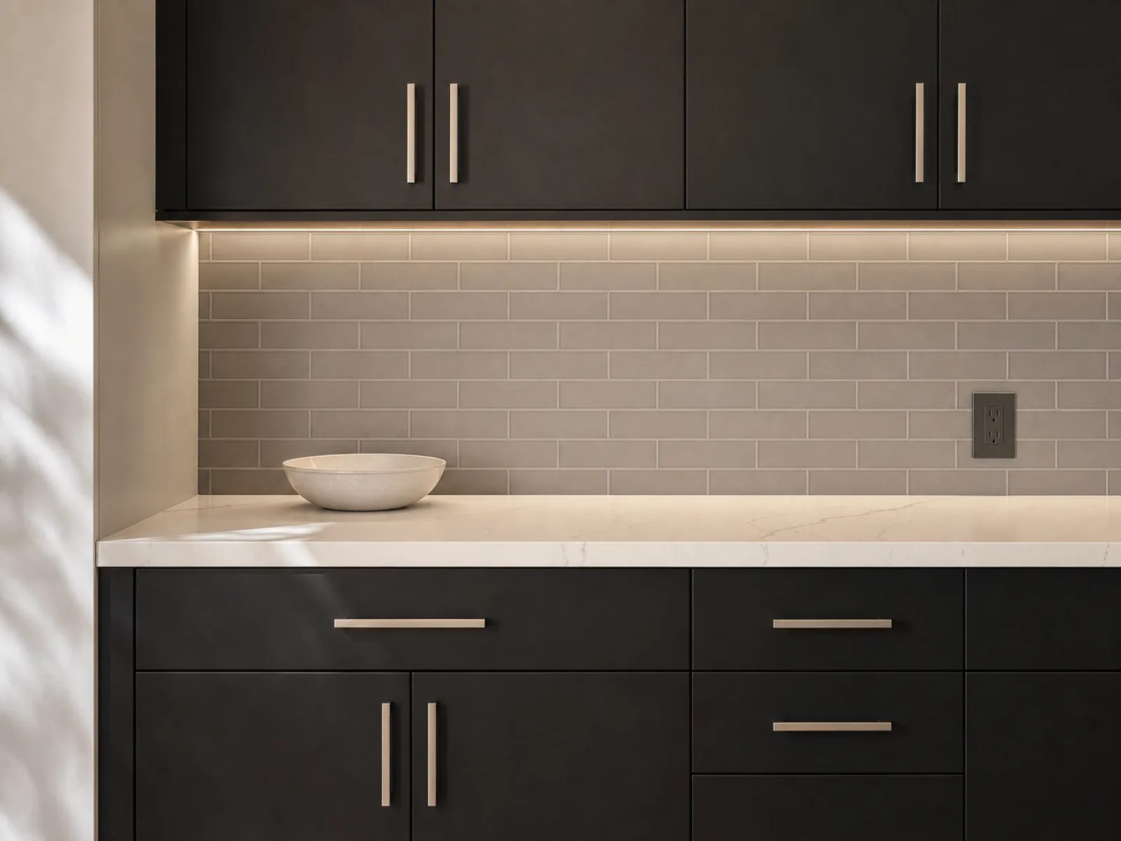
7. Soft gray tile as the bridge between black and white
Black cabinets and white counters produce the hardest contrast available. Some people want that. Others find it stark once it is installed at full scale.
Gray solves it. A middle-value gray sits between the two and softens the jump without muddying either. Choose a pale warm gray for espresso and walnut, a cool gray for charcoal and blue-black cabinets. Gray marble does the same job with more depth, and a gray penny or mosaic tile adds texture if the counter is plain.
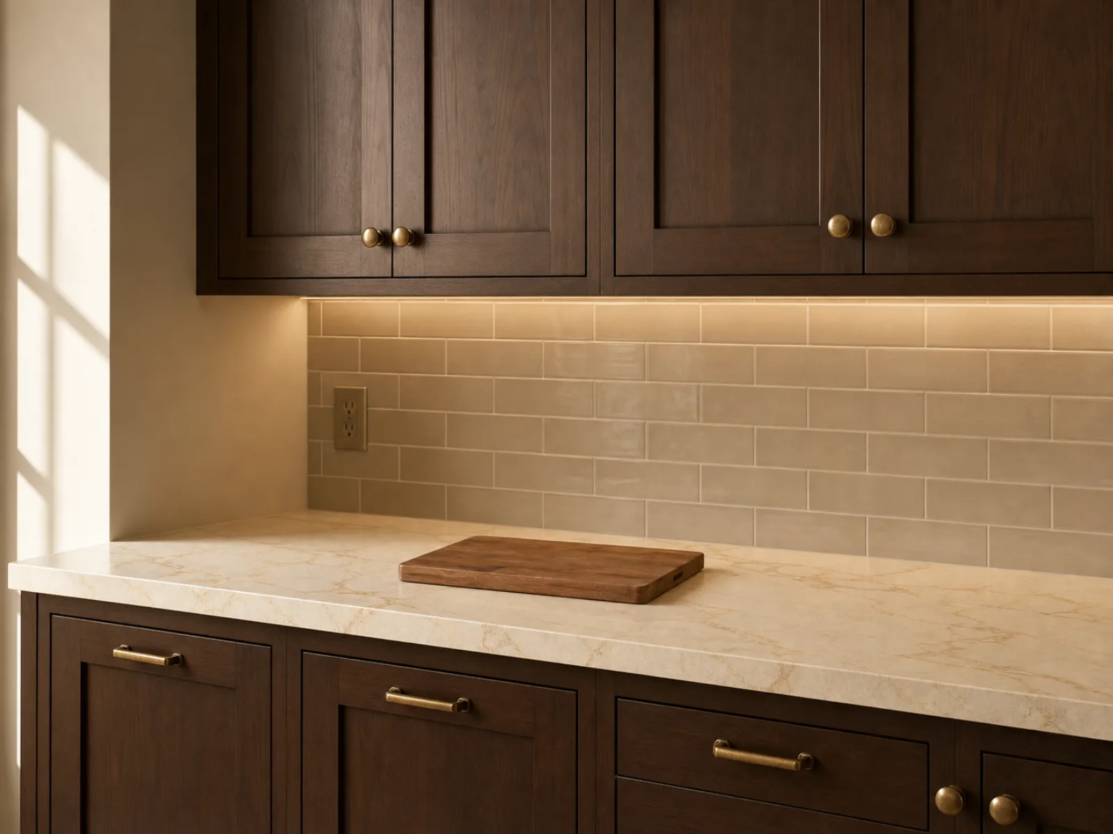
8. Greige, cream and ivory for espresso and walnut
Stark white can look cold against warm brown cabinets. If your doors are Espresso, Kona, walnut or dark cherry, and your counters lean cream or beige, a greige or ivory tile will look more resolved than a bright white.
Tie the tile to the countertop undertone, not to the cabinet. Matching the cabinet exactly is what makes a backsplash look like an afterthought.
This pairs particularly well with brass or champagne bronze hardware.
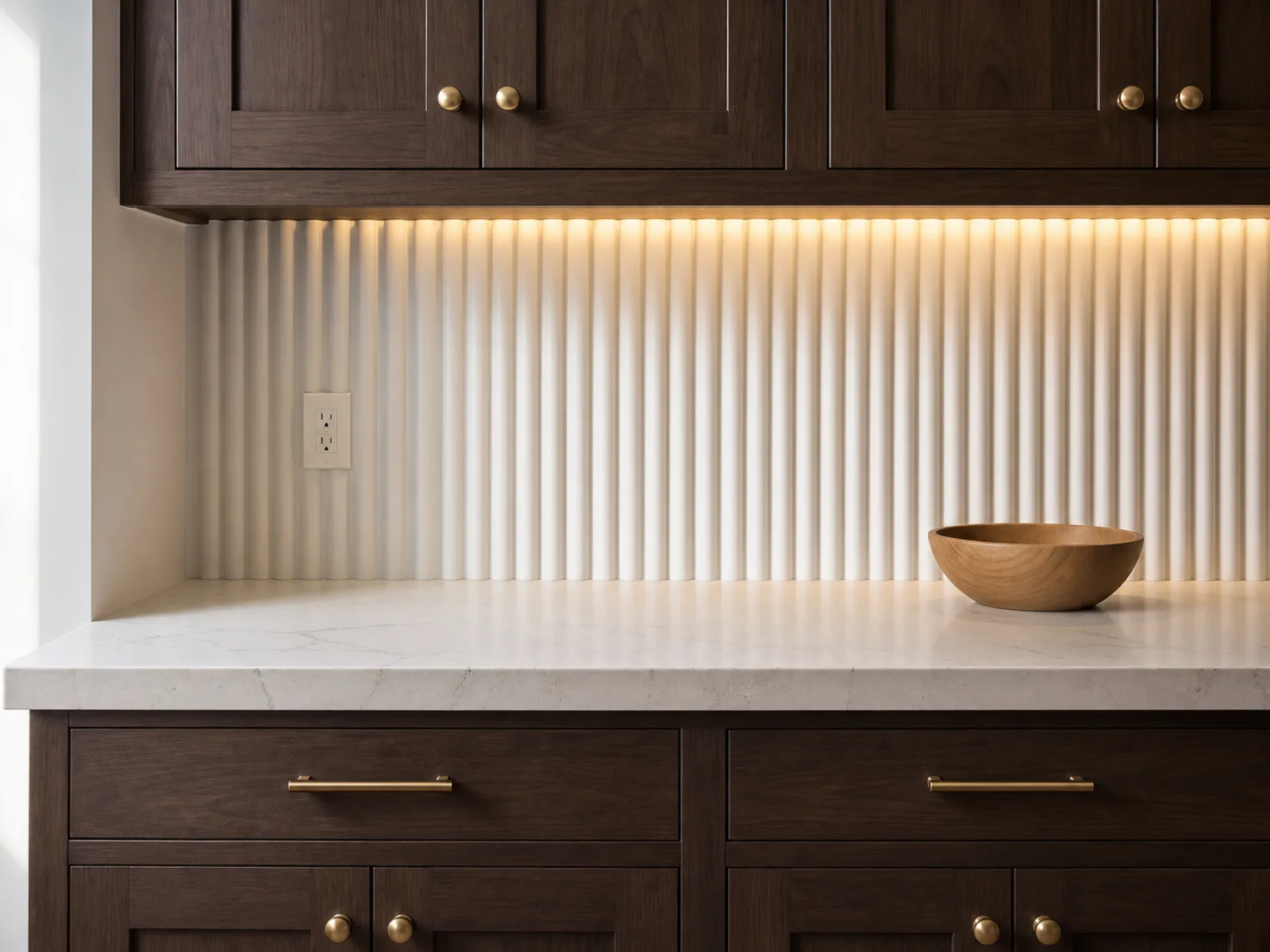
9. Arabesque, fluted and dimensional white tile
Shaped and three-dimensional tile adds interest while staying pale. Fluted and ribbed ceramic creates shadow lines that shift through the day, which gives a white backsplash something to do without adding a second color.
The trade-off is labor. Arabesque and scalloped shapes mean more cuts, more grout and a higher install cost than a rectangular tile covering the same area.
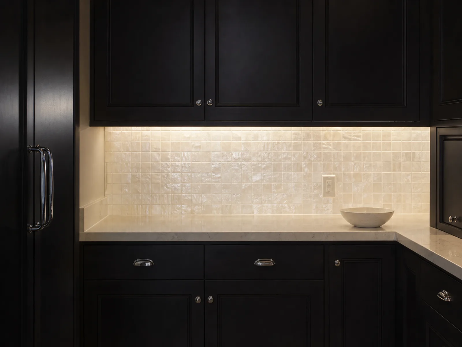
10. Glass mosaic for small or low-light kitchens
Glass reflects and transmits light, which makes it one of the strongest performers in a dark kitchen with limited natural light, along with glossy and pearlescent ceramic. It wipes clean easily, and it comes in solid colors as well as blended and pearlescent finishes.
The downside is grout. Small mosaics mean a lot of joints, and a multicolored blend dates faster than a restrained one. If you go this route, keep the palette tight.
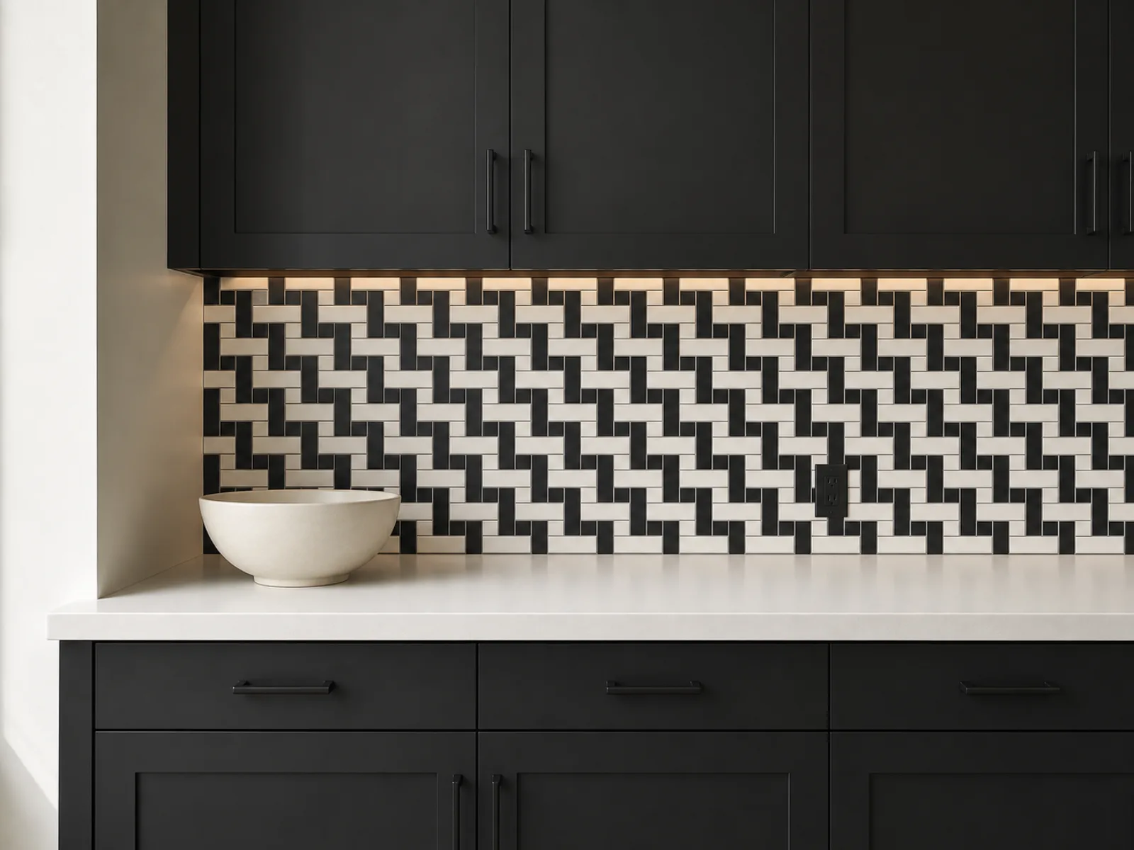
11. Black-and-white pattern
Checkerboard, basketweave, herringbone with dark grout, or a graphic ceramic. These repeat the two values already in the room and turn the backsplash into the thing people notice.
Treat it as the focal point and let everything else calm down. If the backsplash is patterned, the floor and the counter should not be.
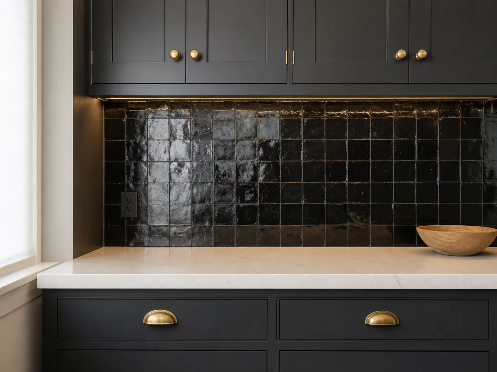
12. Black zellige and other dark backsplashes
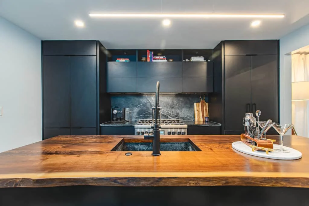
Sometimes the right answer is to stop fighting the darkness and commit to it. A black zellige, also spelled zellij, or a dark ceramic or black marble backsplash produces an enveloping kitchen rather than a bright one.
This needs the right room. Generous natural light, strong under-cabinet lighting, pale countertops, and light walls or flooring to keep the balance. In a small kitchen with one window, it will close the room in.
Glossy black zellige has irregular light variation that keeps it alive. Matte black is flatter and more architectural.
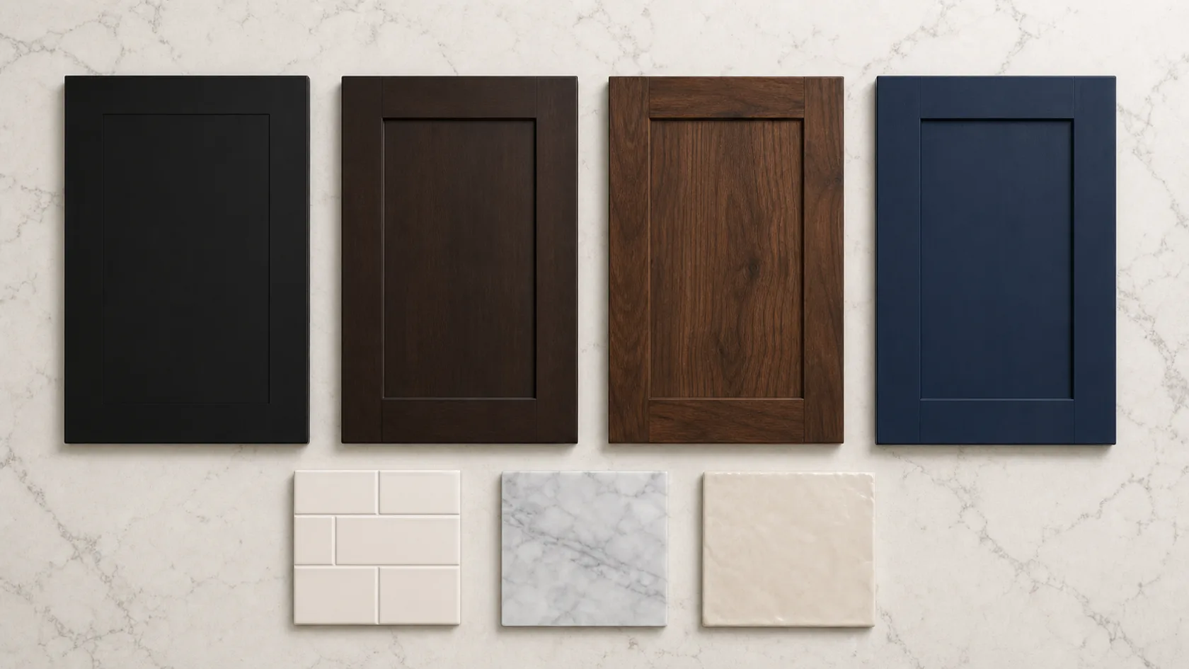
The best backsplash for each dark cabinet color
| Cabinet color | Backsplash directions that work | What to watch |
|---|---|---|
| Black Illume Carbone Matte |
Warm white, iridescent white, gray marble, quartz slab, black-and-white pattern | Black is neutral enough to carry either a quiet or a bold backsplash |
| Dark gray and charcoal Onyx Cobblestone, Galaxy Cobblestone |
Crisp white, pale gray, marble, blue-gray, cool green | Check whether the door has a blue or a brown undertone before choosing |
| Espresso and dark brown Galaxy Espresso, Luna Kona, Fusion Kona |
Ivory, cream, warm greige, light gray, warm marble | Avoid an icy white if the wood and counter are warm |
| Dark walnut and natural wood Galaxy Timber |
Off-white handmade tile, pale stone, warm gray | Visible grain pairs well with tile that has its own texture |
| Dark cherry | Cream, warm beige, restrained stone | Red undertones can intensify next to certain greens, so sample carefully |
| Navy and indigo Luna Indigo, Galaxy Indigo |
White subway, pearl glass, pale gray marble | Brass, nickel and chrome each push the room a different direction |
| Forest green | Ivory, warm white, gray marble, cream zellige | Brass or bronze accents add warmth |
The named Fabuwood finishes above are doors we regularly stock, so you can take a sample home the same day and hold it against tile samples in your own light. Dark cherry and forest green are included as general guidance rather than as products we carry. Stock moves, so confirm current availability with your nearest location. Browse the full range in our Allure and Illume collections, or see finished kitchens in the idea gallery.
USA Cabinet Store has built kitchens in exactly these palettes. Their walnut and white project in Great Falls shows a flat-panel walnut kitchen with a subway backsplash, and their Northern Virginia transitional kitchen pairs walnut and matte black doors with a granite island.
Matching the backsplash to your light countertop
| Countertop | Backsplash approach |
|---|---|
| Plain white quartz | Free rein. Color, texture, geometric tile or a patterned focal point all work |
| White quartz with subtle gray veining | White, pale gray, marble-look tile, blue-gray or sage |
| Strongly veined quartz or marble | Keep it quiet. Solid or softly textured, or continue the slab |
| Cream or beige quartz | Ivory, warm greige, handmade cream, olive or muted terracotta |
| Light granite with speckling | Pull one quiet background tone out of the slab. Do not add a second pattern |
| Light quartzite | A slab backsplash, or a very restrained handmade tile |
| Pale concrete-look | White, gray, black-and-white, matte ceramic |
The pattern across all seven rows is the same. The busier the counter, the quieter the backsplash.
Grout color for dark cabinets and light countertops
Grout changes the finished look almost as much as the tile does, and it is the detail people regret most.
Tonal grout, meaning grout close to the tile color, makes the backsplash read as a surface. The tile shape softens, the wall feels calmer, and the whole thing looks more expensive than it cost. This is the safer choice in nearly every dark-cabinet kitchen, because you already have plenty of contrast from the cabinets.
Contrasting grout turns the backsplash into a grid and makes the tile shape the feature. It suits industrial and traditional kitchens, and it works with a simple white subway when you want the pattern to show. It is also less forgiving of an imperfect install.
There is a maintenance argument almost nobody makes at the selection stage, and it is the one people raise afterwards. A common complaint from homeowners a year or two in is hating how much grout a small-format subway backsplash has to clean. Grease and steam settle into the joints, and a wall of three-by-six tile has a lot of joints. If cleaning matters more to you than the look of a classic subway, that alone is an argument for large-format tile or a slab.
The other practical note from people who have lived with it: light grout in a cooking zone is more likely to show grease and discoloration. If you are tiling behind the range, either go tonal with a mid-tone tile or use an epoxy grout and accept the higher install cost.
How high should the backsplash go?
The old default was a four-inch strip, and it is fading fast. Houzz found in its 2025 study that 67% of renovators ran the backsplash from the counter up to the cabinets or the range hood, and another 12% took it all the way to the ceiling.
Full height behind the range is the highest-impact version and the easiest to justify: that is the wall that gets splattered, and it is the wall people look at.
Counter to upper cabinets is the standard and it suits most kitchens. Counter to ceiling makes the room feel taller, which is worth considering in a dark kitchen where the cabinets already pull the eye down.
The detail that ruins otherwise good backsplashes is how it ends on an open wall. A backsplash that simply stops mid-wall looks unfinished. End it at a natural break, an outside corner, the edge of a cabinet run, or the end of the counter, and finish the edge with a metal trim profile or a bullnose tile rather than leaving raw tile edges.
What a backsplash costs with dark cabinets?
Rough 2026 national ranges, useful for narrowing your options before you shop. These are installed figures covering material plus labor, except the paint row, which is a materials-only DIY cost. Regional labor rates move these ranges considerably, so treat them as relative ordering rather than as quotes.
| Option | Installed cost per sq ft |
|---|---|
| Painting existing tile | Under $5 |
| Basic ceramic subway | $10 to $25 |
| Large-format porcelain | $15 to $40 |
| Glass mosaic | $25 to $50 |
| Marble tile | $25 to $60 |
| Zellige | $30 to $70 |
| Quartz or quartzite slab | $80 to $150 |
Labor is the variable people underestimate. Shaped tile, herringbone layouts and mosaics all cost more to install than a straightforward rectangular tile covering the same wall, sometimes double.
The practical takeaway for most kitchens: a slab behind the range with coordinating tile elsewhere gets you the look for a fraction of a full slab install.
Five mistakes to avoid with dark cabinets and light countertops
Letting the room go dark. Dark cabinets plus a dark backsplash plus limited natural light produces a kitchen that photographs well and is unpleasant to cook in. Under-cabinet lighting matters more in a dark kitchen than in any other, and it is the first thing to budget for.
Two focal points. A veined counter and a patterned backsplash cancel each other out. Choose one.
Getting the undertone wrong. A cool white tile next to warm espresso cabinets reads as a mistake even when nobody can say why. Sample in the room, not in the store.
High-contrast grout you did not plan for. Dark grout with white tile is a design decision. Make it deliberately, and know that light grout behind a range is more likely to show grease over time.
A backsplash that stops nowhere. Plan the termination point and the edge trim before the tile is ordered, not on install day.
Two more worth knowing: highly porous materials such as unsealed limestone and cement stain easily in a kitchen, and skipping expansion gaps where the tile meets the countertop is what causes cracked tiles a year later.
Dark cabinets we stock, and the backsplashes that suit them
The named Fabuwood finishes in the table above are regularly in stock, which means you can usually take a door sample home the same day and hold it against tile samples in your own light. That is the only reliable way to make this decision. Availability changes, so check with your nearest location before you plan around a specific finish.
Our designer Hatice Halac handles cabinet selection from the first conversation through to the order. She will pull the door samples, talk through which backsplash directions suit the finish you are leaning toward, and put together a free 3D design so you can see the cabinets, counters and backsplash together before anything is bought.
Talk to Hatice about your dark-cabinet kitchen
Free 3D design. In-stock cabinets, same-day pickup, best price guarantee.
One last thing, and it is the argument we make more than any other.
Spend carefully on the backsplash. It is the cheapest of the three surfaces to change, and a good tile in the right color costs a fraction of a slab. Do not economize on the cabinet boxes. Particleboard boxes behind a good backsplash is a regret we hear often from people who bought online to save money, and unlike a tile choice it takes a full replacement to fix. Plywood boxes cost more up front and outlast them.
Save on the tile. Buy the boxes once.
Backsplash Frequently questions for dark cabinets and light countertops
What color backsplash goes with dark cabinets?
White and off-white are the most reliable, and they were the two leading backsplash colors in the Houzz 2026 study at 31% and 26%. Gray works as a bridge when black-and-white contrast feels too hard, and cream or greige suits warm brown cabinets better than a bright white.
Should the backsplash be lighter than the cabinets?
In most kitchens, yes. Dark cabinets absorb light and a pale backsplash returns it. Dark backsplashes work when the kitchen has good natural light, strong under-cabinet lighting and pale counters.
Should I choose the backsplash or the countertop first?
The countertop. It is more expensive, more visually dominant and harder to change, so its undertones should guide the tile rather than the reverse.
What backsplash goes with black cabinets and white countertops?
Warm white subway, iridescent or pearlescent white, gray marble, or a black-and-white pattern if you want the backsplash to be the feature. Black is neutral enough to support a quiet or a bold choice.
Can I use a dark backsplash with dark cabinets?
Yes, with conditions. You need natural light, under-cabinet lighting, pale countertops and light walls or flooring. In a small kitchen with one window it will close the room in.
What backsplash makes a kitchen look bigger?
Pale and reflective. Glossy ceramic, glass and pearlescent finishes bounce light. Running the tile to the ceiling and stacking it vertically both draw the eye up and make the room feel taller.
What backsplash is easiest to clean?
Large-format porcelain, quartz slab, glass and glazed ceramic. Fewer grout lines means less to scrub, which is why slab is popular behind ranges.
How high should a backsplash go behind the stove?
Full height to the hood or the ceiling is the most practical choice, because that is the wall that takes the heat and the splatter. Houzz found 67% of 2025 renovators went to the cabinets or hood and 12% went to the ceiling.
How do you modernize a kitchen with dark cabinets?
Change the backsplash first, because it costs the least and shifts the most. After that, swap the hardware for a warm metal such as brass or champagne bronze, add under-cabinet lighting, and take the backsplash to full height behind the range. Those four changes update a dark kitchen without touching the cabinets.
Browse more dark-cabinet kitchens in USA Cabinet Store’s project gallery, or compare tile and countertop options in person.